Best Wedding DJ Website Layout for More Inquiries
Key Takeaways (TL;DR)
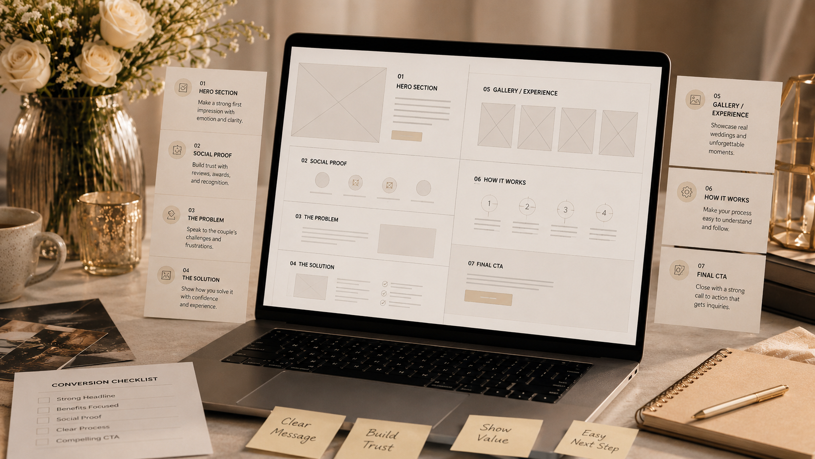
- A logical narrative flow—Hook, Credibility, Connection, Proof, Clarity, Close—guides visitors toward inquiry.
- The Hero section must immediately capture attention and provide a clear call to action.
- Placing social proof high on the page establishes immediate authority.
- Clearly outlining your process reduces anxiety and increases the likelihood of a couple reaching out.
The flow of your website should guide a couple from "Who is this?" to "We need to book them!" in a logical, psychological sequence. If your layout is confusing, visitors will bounce before they ever see your reviews. Here is the blueprint for a high-converting DJ landing page.
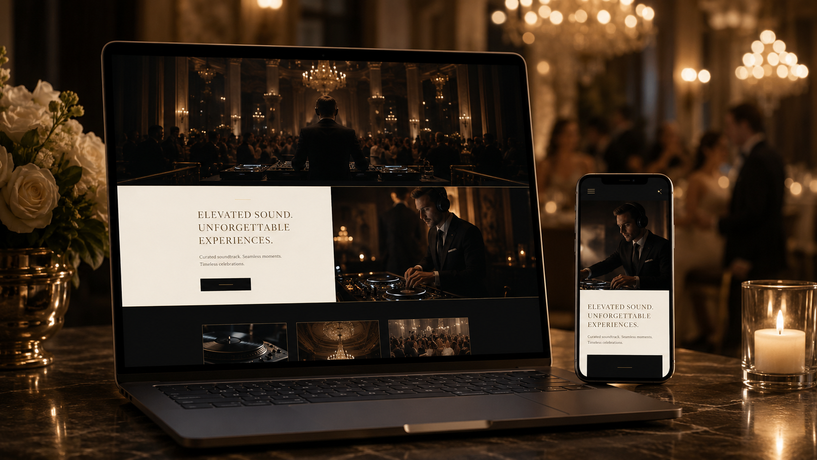
1. The Hero (The Hook)
This is your elevator pitch. One stunning photo, one clear headline, and one primary button. Don't clutter this space with your life story; its only job is to get them to keep scrolling.
2. Social Proof Bar (The Credibility)
Immediately below the hero, show logos of venues you've worked at or "Best of Weddings" badges. This creates instant authority and "local trust" before they even read your first paragraph of copy.
3. The Problem & Solution (The Connection)
Acknowledge that planning a wedding is stressful and that the wrong DJ can ruin the vibe. Then, present your service as the solution that provides peace of mind, a packed dance floor, and a flawless timeline.
4. The Gallery (The Proof)
Now that they trust you, show them what they're buying. Use a clean, modern grid of images and videos. This is where they start visualizing themselves and their friends at their own reception.
5. The Process (The Clarity)
Explain how easy it is to work with you. Step 1: Inquire. Step 2: Plan. Step 3: Party. People are 40% more likely to reach out when they know exactly what the next steps are.
6. The Final CTA (The Close)
End the page with a strong, high-contrast section. Remind them that dates fill up fast (scarcity) and give them one clear, large button to start the process. Don't let them leave without a final nudge.
Frequently Asked Questions
Is a single-page layout better than a multi-page site?
For many DJs, a robust single-page design (a landing page layout) converts better because it controls the narrative flow and reduces distractions. However, multi-page sites are generally better for SEO.
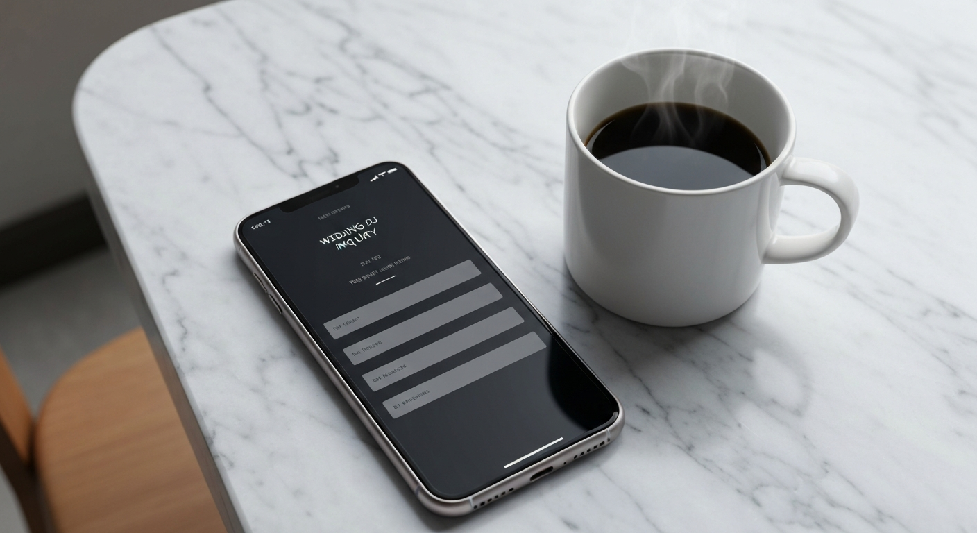
Where is the best place to put the contact form?
Place a primary contact form at the bottom of the page (the "Close" section), and use buttons throughout the page that smoothly scroll the user down to that form.
How important is white space in web design?
Extremely important. White space (or negative space) gives your content room to breathe, makes the site look more premium, and directs the user's eye toward your calls to action.
Related Articles
How to Make Your DJ Website Look More Premium
Simple design tweaks that can justify your premium pricing to high-end clients.

SEO for Premium Wedding DJs in 2026: Winning the 'Invisible' Market
Why traditional keyword stuffing no longer works, and how luxury DJs are quietly capturing high-end couples before they even hit Instagram.
Stop Getting Ghosted: How to Fix Your DJ Website's Inquiry Flow
If couples are visiting your site but disappearing after they see your contact form, your inquiry flow is broken.